胶囊按钮
PillButton 是一种拨动按钮,其样式设计为药丸状或胶囊状,继承自 RoundButton。它被设计为可选中和取消选中,通过在 checked 时高亮显示来直观地指示其状态。
基本胶囊按钮
PillButton 可用于表示开/关状态或选择。它默认是 checkable 的。
qml
import QtQuick 2.15
import RinUI
// ...
PillButton {
text: qsTr("Toggle Option")
// checked: true // 用于初始选中/开启
onCheckedChanged: {
if (checked) {
console.log("PillButton is ON");
} else {
console.log("PillButton is OFF");
}
}
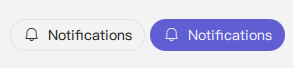
}带图标的胶囊按钮
与标准 Button 类似,可以向 PillButton 添加图标。
qml
PillButton {
    text: qsTr("Notifications")
    icon.name: "ic_fluent_alert_20_regular"
    checked: true // 示例:初始为开启状态

    // 示例:根据状态更改图标
    // icon.name: checked ? "ic_fluent_alert_on_20_filled" : "ic_fluent_alert_20_regular"
}
主要属性
text:string- 显示在按钮上的文本标签。icon.name:string- 按钮的 fluent 图标名称。icon.source:url- 按钮的自定义图像图标的 URL。checked:bool- 确定按钮是处于选中(开)还是未选中(关)状态。highlighted属性会自动绑定到checked。checkable:bool- 指示按钮是否可以被选中。对于PillButton,默认为true。enabled:bool- 控件是否可交互。默认为true。
由于 PillButton 继承自 RoundButton(后者可能又继承自 Button),因此其父组件的其他样式属性也可以应用。
信号
onCheckedChanged(): 当checked状态更改时发出。onClicked(): 当按钮被点击时发出。由于它是checkable的,点击也会切换checked状态。