浮出控件
Flyout 显示轻量级 UI,用于提供信息或需要用户交互。与 Dialog 不同,Flyout 通常附加到特定控件,并且可以通过在其外部单击或点击来轻松关闭(标准的 Popup 行为)。它通常用于显示更多详细信息、收集简单输入或要求用户确认操作。
Flyout 继承自 QtQuick.Controls.Basic.Popup。
基本浮出控件
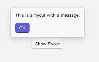
Flyout 通常在响应按钮点击或其他用户操作时打开。它可以包含文本和自定义按钮。target 属性可用于将浮出控件与其打开控件关联,这有助于定位。
qml
import QtQuick 2.15
import RinUI // 这应该使 RinUI 的 Position 枚举可用

// ...

Button {
    id: myButton
    text: qsTr("Show Flyout")
    onClicked: myFlyout.open()
}

Flyout {
    id: myFlyout
    parent: myButton // 将浮出控件相对于 myButton 定位
    text: qsTr("This is a flyout with a message.")

    // 通过将 QML 项列表分配给 buttonBox 来添加按钮
    buttonBox: [
        Button {
            text: qsTr("OK")
            highlighted: true // 示例:设置默认操作的样式
            onClicked: myFlyout.close()
        }
    ]
}
带图像和定位的浮出控件
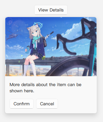
浮出控件可以在顶部显示图像,并使用 position 属性相对于其父控件或 target 控件进行定位。此属性使用 RinUI 特定的 Position 枚举。
qml
Button {
    id: detailsButton
    text: qsTr("View Details")
    onClicked: detailsFlyout.open()

    Flyout {
        id: detailsFlyout
        // 可以直接将 Flyout 嵌套在按钮内部,就不需要定义parent属性

        // Position 枚举可能包括:Position.Top, Position.Bottom, Position.Left, Position.Right
        // Position.Center (如果可用) 可能会在目标或屏幕上居中显示。
        position: Position.Bottom // 示例:在目标下方显示
        image: Qt.resolvedUrl("../../assets/BA_Pic_Shiroko-chibi.png") // 确保路径正确
        text: qsTr("More details about the item can be shown here.")
        maximumWidth: 300
        buttonBox: [
            Button {
                text: qsTr("Confirm")
                onClicked: detailsFlyout.close()
            },
            Button {
                text: qsTr("Cancel")
                onClicked: detailsFlyout.close()
            }
        ]
    }
}
主要属性
text:string- 显示在浮出控件内的主要文本内容。image:url- 可选的图像 URL,显示在浮出控件的顶部。图像以fillMode: Image.PreserveAspectCrop显示。buttonBox:list<Item>- (buttonLayout.data的别名) 接受 QML 项(通常是Button)的列表,这些项将放置在浮出控件底部的水平RowLayout中。position:Position(枚举) - 指定浮出控件的首选位置(例如Position.Top、Position.Bottom、Position.Left、Position.Right)。默认为Position.Top。这使用 RinUI 的自定义Position枚举(可能在RinUI.utils.Position中找到)。maximumWidth:real- 浮出控件内容区域可以扩展到的最大宽度。默认为350。padding:real- 浮出控件内容周围的填充。默认为16。
继承自 Popup:
parent:Item- 浮出控件相对于其定位的项。Flyout的x和y属性会根据target和position自动计算。opened:bool(只读) - 浮出控件当前是否可见。open(): 显示浮出控件的方法。close(): 隐藏浮出控件的方法。closePolicy:Popup.ClosePolicy(枚举) - 定义用户交互如何关闭浮出控件。典型的浮出控件行为(轻关闭)通常是Popup.CloseOnEscape | Popup.CloseOnPressOutsideParent。
样式
Flyout 具有带样式的背景(源码指示为亚克力颜色、边框和阴影,尽管提供的代码片段中背景矩形本身被注释掉了,但样式可能以不同方式应用)并包含用于不透明度和位置的进入/退出动画。