列表视图 (ListView)
ListView 组件用于显示可垂直滚动的数据项列表。它继承自 QtQuick.Controls.Basic.ListView,并提供自定义样式、项目动画以及基于 ListViewDelegate 的默认委托来渲染项目。
带默认委托的基本列表视图
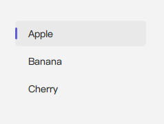
ListView 需要一个 model 来提供数据。如果为模型的 textRole 属性正确设置,默认委托(ListViewDelegate 的实例)可以显示简单文本。
qml
import QtQuick 2.15
import RinUI

// ...

ListModel {
    id: mySimpleModel
    ListElement { itemName: "Apple" }
    ListElement { itemName: "Banana" }
    ListElement { itemName: "Cherry" }
}

ListView {
    width: 200
    height: 250
    model: mySimpleModel
    textRole: "itemName" // 指定默认委托应显示的模式属性
}
默认的 ListViewDelegate 将此文本放置在其 middleArea 中。
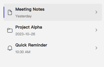
使用 ListViewDelegate 自定义项目外观
要创建更丰富的列表项,您可以向 ListView 的 delegate 属性提供 ListViewDelegate 的自定义实例。ListViewDelegate 本身是一个组件,将其内容构建为三个主要区域:leftArea、middleArea 和 rightArea。
qml
import QtQuick 2.15
import RinUI // 确保 ListViewDelegate、IconWidget 等 RinUI 类型可用

// ...

ListView {
    width: 350
    height: 300
    model: ListModel {
        ListElement { titleText: "Meeting Notes"; dateText: "Yesterday"; iconSymbol: "ic_fluent_document_20_regular" }
        ListElement { titleText: "Project Alpha"; dateText: "2023-10-26"; iconSymbol: "ic_fluent_folder_20_regular" }
        ListElement { titleText: "Quick Reminder"; dateText: "10:30 AM"; iconSymbol: "ic_fluent_alert_20_regular" }
    }

    delegate: ListViewDelegate {
        // width is typically bound to ListView.view.width by the delegate itself
        // height is adaptive by default (contents.implicitHeight + 20)

        leftArea: IconWidget {
            icon: model.iconSymbol // Access model data for the icon
            size: 22
            Layout.alignment: Qt.AlignVCenter // Aligns icon within the Row of leftArea
        }

        middleArea: [ // middleArea takes a list of items for its ColumnLayout
            Text {
                text: model.titleText // Main text from model
                font.bold: true
                elide: Text.ElideRight
                Layout.fillWidth: true
            },
            Text {
                text: model.dateText // Secondary text from model
                font.pixelSize: 12
                color: Theme.currentTheme.colors.textSecondaryColor
                elide: Text.ElideRight
                Layout.fillWidth: true
            }
        ]

        rightArea: ToolButton { // Example: a ToolButton on the right
            icon.name: "ic_fluent_chevron_right_20_regular"
            flat: true
            size: 16
            Layout.alignment: Qt.AlignVCenter // Aligns button within the RowLayout of rightArea
            onClicked: {
                console.log("More options for:", model.titleText);
            }
        }

        onClicked: {
            console.log("Clicked on item:", model.titleText);
            // ListView.view.currentIndex is automatically updated by the delegate's default onClicked handler
        }
    }
}
ListViewDelegate 自定义区域:
leftArea: 内部Row的data属性的别名。此处添加的项目显示在委托的左侧。通常用于图标、头像或选择标记。middleArea: 内部ColumnLayout的data属性的别名。此处添加的项目构成主要内容,垂直排列。ListView提供的默认委托(如果您未指定自己的delegate组件)将其单个Text项放置在此处。rightArea: 内部RowLayout的data属性的别名。此处添加的项目显示在右侧,通常用于次要操作、状态指示器或时间戳。
项目动画
RinUI 的 ListView 包含用于 add、remove 和 displaced 状态的内置 Transition 转换。这些在模型更改时提供平滑的不透明度和缩放动画用户体验。
滚动条
垂直的 RinUI.ScrollBar 会自动包含并配置 policy: ScrollBar.AsNeeded。当内容超出 ListView 的高度时,它将变得可见。
ListView 主要属性
model:any- 为列表提供项目的数据模型(例如ListModel、JavaScript 数组、项目计数的整数)。delegate:Component- 用于列表中每个项目的 QML 组件。对于自定义项目外观,在此处实例化ListViewDelegate并填充其leftArea、middleArea或rightArea属性。如果未指定,则使用默认的ListViewDelegate。textRole:string- 如果使用隐式默认委托并且您的模型提供复杂对象(如ListElement或 JavaScript 对象),则此属性指定模型项目的哪个角色(属性名称)应由该默认委托显示为文本。keyboardNavigation:bool- 启用基于键盘的项目间导航。在 RinUI 的ListView中默认为false。clip:bool- (继承自Item,在ListView中默认为true) 确定子项是否被裁剪到视图的边界。
继承自 QtQuick.Controls.Basic.ListView:
- 许多标准属性,如
currentIndex、currentItem、count、orientation(尽管 RinUI 的版本主要为垂直列表设计样式和使用)、spacing(委托之间的间距)、header、footer等。 - 标准方法,如
positionViewAtIndex()、itemAt()等。
信号
ListView的标准信号,如clicked(int index)、activated(int index)、pressAndHold(int index)、currentItemChanged等均可用。
相关组件
ListViewDelegate: 用于渲染ListView中每个项目的组件。自定义此委托是实现丰富列表项外观的关键。ScrollBar: 内部用于滚动。