ListView
The ListView component is used to display a list of data items that can scroll vertically. It inherits from QtQuick.Controls.Basic.ListView and provides custom styling, item animations, and a default delegate based on ListViewDelegate for rendering items.
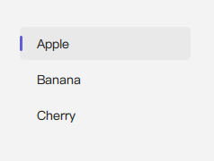
Basic ListView with Default Delegate
A ListView requires a model to provide data. The default delegate (an instance of ListViewDelegate) can display simple text if the textRole property of the ListView is set correctly for the model.
import QtQuick 2.15
import RinUI

// ...

ListModel {
    id: mySimpleModel
    ListElement { itemText: "Apple" }
    ListElement { itemText: "Banana" }
    ListElement { itemText: "Cherry" }
}

ListView {
    width: 200
    height: 250
    model: mySimpleModel
    textRole: "itemText" // Specifies which model property the default delegate should display
}
The default ListViewDelegate places this text in its middleArea.
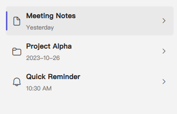
Customizing Item Appearance with ListViewDelegate
To create richer list items, you provide a custom instance of ListViewDelegate to the delegate property of the ListView. ListViewDelegate is itself a component that structures its content into three main areas: leftArea, middleArea, and rightArea.
import QtQuick 2.15
import RinUI // Ensures ListViewDelegate, IconWidget etc. are available

// ...

ListModel {
    id: contactModel
    ListElement { name: "Alice Wonderland"; status: "Online"; iconName: "ic_fluent_person_20_filled" }
    ListElement { name: "Bob The Builder"; status: "Offline"; iconName: "ic_fluent_person_20_regular" }
    ListElement { name: "Charlie Brown"; status: "Busy"; iconName: "ic_fluent_person_prohibited_20_filled" }
}

ListView {
    width: 350
    height: 300
    model: ListModel {
        ListElement { titleText: "Meeting Notes"; dateText: "Yesterday"; iconSymbol: "ic_fluent_document_20_regular" }
        ListElement { titleText: "Project Alpha"; dateText: "2023-10-26"; iconSymbol: "ic_fluent_folder_20_regular" }
        ListElement { titleText: "Quick Reminder"; dateText: "10:30 AM"; iconSymbol: "ic_fluent_alert_20_regular" }
    }

    delegate: ListViewDelegate {
        // width is typically bound to ListView.view.width by the delegate itself
        // height is adaptive by default (contents.implicitHeight + 20)

        leftArea: IconWidget {
            icon: model.iconSymbol // Access model data for the icon
            size: 22
            Layout.alignment: Qt.AlignVCenter // Aligns icon within the Row of leftArea
        }

        middleArea: [ // middleArea takes a list of items for its ColumnLayout
            Text {
                text: model.titleText // Main text from model
                font.bold: true
                elide: Text.ElideRight
                Layout.fillWidth: true
            },
            Text {
                text: model.dateText // Secondary text from model
                font.pixelSize: 12
                color: Theme.currentTheme.colors.textSecondaryColor
                elide: Text.ElideRight
                Layout.fillWidth: true
            }
        ]

        rightArea: ToolButton { // Example: a ToolButton on the right
            icon.name: "ic_fluent_chevron_right_20_regular"
            flat: true
            size: 16
            Layout.alignment: Qt.AlignVCenter // Aligns button within the RowLayout of rightArea
            onClicked: {
                console.log("More options for:", model.titleText);
            }
        }

        onClicked: {
            console.log("Clicked on item:", model.titleText);
            // ListView.view.currentIndex is automatically updated by the delegate's default onClicked handler
        }
    }
}
ListViewDelegate Customization Areas:
leftArea: An alias to thedataproperty of an internalRow. Items added here appear on the left side of the delegate. Typically used for icons, avatars, or selection marks.middleArea: An alias to thedataproperty of an internalColumnLayout. Items added here form the main content, arranged vertically. The default delegate provided byListView(if you don't specify your owndelegatecomponent) places its singleTextitem here.rightArea: An alias to thedataproperty of an internalRowLayout. Items added here appear on the right side, often used for secondary actions, status indicators, or timestamps.
Item Animations
RinUI's ListView includes built-in Transitions for add, remove, and displaced states. These provide opacity and scale animations for a smooth user experience when the model changes.
ScrollBar
A vertical RinUI.ScrollBar is automatically included and configured with policy: ScrollBar.AsNeeded. It becomes visible when the content exceeds the ListView's height.
Key ListView Properties
model:any- The data model that provides items for the list (e.g.,ListModel, JavaScript array, integer for item count).delegate:Component- The QML component used to instantiate each item in the list. For custom item appearances, instantiateListViewDelegatehere and populate itsleftArea,middleArea, orrightAreaproperties. If not specified, a defaultListViewDelegateis used.textRole:string- If using the implicit default delegate and your model provides complex objects (likeListElements or JavaScript objects), this property specifies which role (property name) of the model item should be displayed as text by that default delegate.keyboardNavigation:bool- Enables keyboard-based navigation between items. Defaults tofalsein RinUI'sListView.clip:bool- (Inherited fromItem, set totrueby default inListView) Determines if children are clipped to the view's boundaries.
Inherited from QtQuick.Controls.Basic.ListView:
- Many standard properties such as
currentIndex,currentItem,count,orientation(though RinUI's version is primarily styled and used for vertical lists),spacing(between delegates),header,footer, etc. - Standard methods like
positionViewAtIndex(),itemAt(), etc.
Signals
- Standard signals from
ListViewlikeclicked(int index),activated(int index),pressAndHold(int index),currentItemChanged, etc., are available.
Related Components
ListViewDelegate: The component used to render each item in theListView. Customizing this delegate is key to achieving rich list item appearances.ScrollBar: Used internally for scrolling.