DatePicker
The DatePicker provides a standardized way to let users select a date (year, month, and day). It appears as a button displaying the currently selected date (or placeholders). When clicked, it opens a custom picker view (an internal PickerView component) to allow the user to change the date.
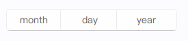
Basic DatePicker
A DatePicker by default shows placeholders or the current system date if not interacted with. Once a date is selected, it's displayed on the button.
import QtQuick 2.15
import RinUI
// ...
DatePicker {
id: myDatePicker
width: 250 // Default implicitWidth
// React to date changes
onDateChanged: {
console.log("Selected date string:", date) // Format: YYYY-M-D
console.log("Year:", year, "Month:", month, "(index:", monthIndex + ")", "Day:", day)
}
// Example of setting an initial date
Component.onCompleted: {
// setDate returns true on success
if (!setDate(new Date().getFullYear() + "-01-01")) { // Set to Jan 1st of current year
console.warn("Failed to set initial date for myDatePicker")
}
}
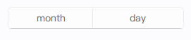
}Hiding the Year
You can hide the year column from the picker and the display by setting the yearVisible property to false.
import RinUI // Consistent import

DatePicker {
    width: 180 // May need less width if year is hidden
    yearVisible: false
}
Setting the Date Programmatically
The setDate() method allows you to set the date of the picker. It accepts a string in "YYYY-MM-DD" or "YYYY/MM/DD" format.
import RinUI // Consistent import

DatePicker {
    id: eventDatePicker
    width: 250

    function initializeDate() {
        var success = eventDatePicker.setDate("2025-12-24");
        if (success) {
            console.log("Event date set to:", eventDatePicker.date);
        } else {
            console.log("Failed to set event date.");
        }
    }

    Component.onCompleted: initializeDate()
}
Localization
The DatePicker respects the application's locale (an inherited property) for month names and the display order of year, month, and day fields.
Key Properties
date:string(readonly) - A string representation of the selected date (e.g., "2023-10-26"). Changes to this property can be tracked withonDateChanged.year:int(alias) - The selected year. Can be set programmatically by setting thepickerView.value3if direct manipulation is needed, thoughsetDate()is preferred.month:string(alias, readonly for direct assignment) - The selected month name (localized).monthIndex:int(alias, readonly for direct assignment) - The selected month index (0 for January, 11 for December).day:int(alias) - The selected day. Can be set programmatically by setting thepickerView.value2.yearVisible:bool- Iffalse, the year selector is hidden. Defaults totrue.startYear:int- The minimum year available in the picker. Defaults to1925.endYear:int- The maximum year available in the picker. Defaults to2125.enabled:bool- Whether the control is interactive. Inherited fromControl.
Methods
setDate(string yyyymmdd): Sets the picker's current date. The input string should be in "YYYY-MM-DD" or "YYYY/MM/DD" format (e.g., "2023-10-26"). Returnstrueon success,falseor-1on parse failure or invalid date.
The DatePicker itself is a Button, so properties related to button styling and behavior (like flat, highlighted, primaryColor) can also be applied to affect its appearance.