Frame
The Frame component in RinUI is a styled container that inherits from QtQuick.Controls.Basic.Frame. It provides a customizable background with properties for color, border, and corner radius, and includes optional hover effects. It's often used as a base for other components or to group related UI elements with a common visual styling. By default, clip is set to true.
Basic Frame
A Frame can be used to visually group content. You can place child items directly within a Frame; these children are parented to the Frame's contentItem. Standard padding properties can be used to create space between the frame's edges and its content.
import QtQuick 2.15
import RinUI
// ...
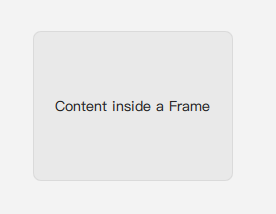
Frame {
width: 200
height: 150
padding: 10 // Content is placed within this padding
// Custom appearance properties
color: Theme.currentTheme.colors.subtleSecondaryColor // Background color
radius: 8 // Corner radius
borderColor: Qt.rgba(0, 0, 0, 0.1) // Border color
borderWidth: 1 // Border width
Text {
anchors.centerIn: parent // Anchors relative to contentItem's area
text: qsTr("Content inside a Frame")
}
}Frameless Mode
Set the frameless property to true to make the visible background (color and border) of the Frame disappear. The Frame itself still exists as a layout container and will continue to clip its content if clip is true. This can be useful for grouping and clipping without adding visual decoration.
Hover Effects
If hoverable is true (the default), the Frame's background opacity changes slightly on mouse hover, providing visual feedback. The hover property can be used to react to this state.
Key Properties
color:color- The background color of the frame. Defaults toTheme.currentTheme.colors.cardColor.radius:real(alias for the backgroundRectangle'sradius) - The corner radius of the frame's background. Defaults toTheme.currentTheme.appearance.smallRadius.borderColor:color- The color of the frame's border. Defaults toTheme.currentTheme.colors.cardBorderColor.borderWidth:int- The width of the frame's border. Defaults toTheme.currentTheme.appearance.borderWidth.frameless:bool- Iftrue, the background rectangle (which shows color and border) is made invisible. Defaults tofalse.hoverable:bool- Iftrue, enables hover detection and visual feedback (opacity change) on the background. Defaults totrue.hover:bool(readonly) - Indicates if the mouse is currently hovering over the frame (providedhoverableistrue).clip:bool- (Inherited fromItem, explicitly set totrueby default in RinUI'sFrame) Determines if children are clipped to the frame's boundaries.
Inherited from QtQuick.Controls.Basic.Frame:
contentItem:Item- The actual container for child items. Children declared as direct children of aFramein QML are automatically reparented to thiscontentItem.- Padding properties (
padding,topPadding,leftPadding,rightPadding,horizontalPadding,verticalPadding) - These control the space between the frame's outer edges and thecontentItem.
Usage as a Base Component
RinUI utilizes Frame as a foundational building block for other components. For instance:
SettingIteminherits fromFrameto provide a consistent row structure in settings pages.- The
Clipcomponent uses aFrameinternally for its styled background.
This demonstrates Frame's utility in creating styled containers with consistent theming.