SettingCard
The SettingCard component, inheriting from Frame, is designed to display a single piece of information or a setting in a card-like row. It features a structured layout with an optional icon on the left, a title and description area, and a slot on the right (the content property) for additional controls or information.
Unlike SettingExpander, SettingCard does not have a collapsible content area; it's a single, non-expandable panel, suitable for straightforward settings or information display.
Basic SettingCard
A SettingCard typically includes an icon, a title, and a description. The content property (which is the default property) can be used to place controls or other items on the right side of the card.
import QtQuick 2.15
import RinUI
// ...
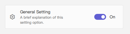
SettingCard {
width: 400 // Or Layout.fillWidth: true if in a Layout like ColumnLayout
icon: "ic_fluent_settings_20_regular" // Fluent icon name for the left area
title: qsTr("General Setting")
description: qsTr("A brief explanation of this setting option.")
// Control placed on the right side via the 'content' default property
Switch { // This Switch is assigned to the 'content' property
checked: true
}
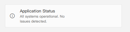
}SettingCard for Information Display
If no control is needed on the right (i.e., the content property is not populated with any items), the card can be used to display information with consistent styling.
import RinUI // Consistent import

SettingCard {
    width: 400
    icon: "ic_fluent_info_20_regular"
    title: qsTr("Application Status")
    description: qsTr("All systems operational. No issues detected.")
    // No child items provided for the 'content' slot on the right
}
Key Properties
title:string- The main text label for the setting card, displayed prominently.description:string- Optional descriptive text displayed below thetitle, typically in a smaller font or secondary color.icon:string(alias for internalIconWidget'siconproperty) - The Fluent icon name for the icon displayed on the left side of the card.source:url(alias for internalIconWidget'ssourceproperty) - URL for a custom image to be used as the icon.iconSize:real(alias for internalIconWidget'ssizeproperty) - Size of the icon. Defaults to20.content:Item(default property alias forrightContent.data) - Allows adding a QML Item (typically a single control likeSwitch,ComboBox, or text label) to the right side of the card.
Inherited from Frame:
color:color- The background color of the card.radius:real- The corner radius of the card.borderColor:color- The border color of the card.borderWidth:int- The border width of the card.frameless:bool- Iftrue, the card's background and border are not visible.hoverable:bool- Enables hover effects on the card.- Padding properties (
leftPadding,rightPadding,topPadding,bottomPadding):SettingCardsets specific default values (e.g.,leftPadding: 15,rightPadding: 15,topPadding: 13,bottomPadding: 13).
Example Usage in a List
SettingCard is suitable for lists of settings or options where each item is distinct and does not require an expandable section.
import QtQuick.Layouts 1.15 // For ColumnLayout
import RinUI // Consistent import

// ...

ColumnLayout { // Using ColumnLayout for automatic sizing and spacing
    width: 350
    spacing: 2 // Small spacing between cards

    SettingCard {
        Layout.fillWidth: true // Makes the card take the width of the ColumnLayout
        title: qsTr("Profile Visibility")
        icon: "ic_fluent_person_20_regular"
        content: ComboBox { model: ["Public", "Friends Only", "Private"] }
    }
    SettingCard {
        Layout.fillWidth: true
        title: qsTr("Desktop Notifications")
        icon: "ic_fluent_alert_20_regular"
        description: qsTr("Enable or disable desktop notifications.")
        content: Switch { checked: false }
    }
    SettingCard {
        Layout.fillWidth: true
        title: qsTr("Data Sync")
        icon: "ic_fluent_cloud_sync_20_regular"
        description: qsTr("Last synced: 2 hours ago")
        // No control in 'content', just info
    }
}
Related Components
Frame: The base component from whichSettingCardinherits its framed appearance.SettingExpander: For settings that require an additional collapsible content area for more details or sub-settings.SettingItem: Another component for displaying rows of settings, typically simpler and often used within aSettingExpander.SettingCardprovides a more visually distinct "card" structure with dedicated icon and content areas.