SettingExpander
The SettingExpander is a specialized version of the Expander component, tailored for creating items typically found in settings pages or lists. It provides a structured header that includes an icon, a title, a description, and a slot for a control on the right side of the header. Like a standard Expander, it also features a collapsible content area for additional details or sub-settings.
Using SettingItem in Collapsible Area
The collapsible content area of a SettingExpander is often populated with SettingItem components to maintain a consistent layout for lists of sub-settings.
import RinUI // Consistent import
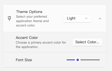
SettingExpander {
width: 400
icon: "ic_fluent_paint_brush_20_regular"
title: qsTr("Theme Options")
description: qsTr("Select your preferred application theme and accent color.")
expanded: false // Example: initially collapsed
// Control in the header's right side
content: ComboBox {
width: 120 // Give it a sensible width
model: ["Light", "Dark", "System"]
}
// Collapsible content populated with SettingItem(s)
SettingItem {
title: qsTr("Accent Color")
description: qsTr("Choose a primary accent color for the application.")
// 'content' of SettingItem (right side of SettingItem's header)
content: Button { text: qsTr("Select Color...") }
}
SettingItem {
title: qsTr("Font Size")
// No description for this SettingItem
content: Slider { width: 100; from: 10; to: 16; value: 12 }
}
}Key Properties
Inherits all properties from Expander (like expanded, expandDirection, enabled, radius), plus specific properties for its structured header:
title:string- The main title text displayed in the header section.description:string- A smaller descriptive text displayed below thetitlein the header.icon:string(alias for internalIconWidget'siconproperty) - The Fluent icon name for the icon displayed on the left in the header.source:url(alias for internalIconWidget'ssourceproperty) - URL for a custom image to be used as the header icon.iconSize:real(alias for internalIconWidget'ssizeproperty) - Size of the icon in the header. Defaults to20.content:Item(alias forrightContent.data) - Allows adding a QML Item (typically a single control likeSwitch,ComboBox, orButton) to the right side of the header area.
The default collapsible content area is populated via the contentData default property (inherited from Expander). Note that SettingExpander sets the base Expander's contentPadding and contentSpacing to 0, so you should manage spacing and padding for items within the collapsible area yourself (e.g., by adding padding to child items or using layouts).
Related Components
Expander: The base component from whichSettingExpanderinherits most of its functionality.SettingItem: Often used within the collapsiblecontentDataarea ofSettingExpanderto list further detailed settings or options.