Expander
The Expander control allows content to be shown or hidden in a collapsible section. It consists of a header, which is always visible, and a content area that can be expanded or collapsed by interacting with the header (typically by clicking it or an expand/collapse button within it).
Basic Expander
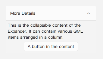
A basic Expander can have a text title in its default header and QML items as its content. Child items are added to the contentData property (which is the default property).
import QtQuick 2.15
import RinUI

// ...
Expander {
width: 300
text: qsTr("More Details") // Text for the default header area
// Content items are added as children and become part of 'contentData'
Text {
text: qsTr("This is the collapsible content of the Expander. It can contain various QML items arranged in a column.")
wrapMode: Text.WordWrap // Ensure text wraps within the available width
Layout.fillWidth: true // If Expander's content area uses a Layout internally (it does - ColumnLayout)
}
Button {
text: qsTr("A button in the content")
Layout.alignment: Qt.AlignHCenter // Align within the internal ColumnLayout
}
}Custom Header
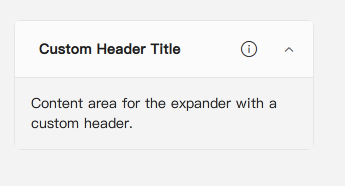
The header of the Expander can be entirely replaced with custom QML content by assigning an Item to the header property.
import RinUI // Consistent import
// Assuming IconWidget and RowLayout are available (e.g., from QtQuick.Layouts or another import)
// import QtQuick.Layouts 1.15 // For RowLayout if not globally available

Expander {
    width: 300
    // When 'header' is set, the default 'text' property and expander icon are not shown.
    // You are responsible for the entire header's content and behavior.
    header: Item {
        id: customHeaderItem
        implicitHeight: 48 // Define a height for your custom header
        width: parent.width // Make it fill the Expander's width

        RowLayout { // Example layout for custom header
            anchors.fill: parent
            anchors.leftMargin: 10
            anchors.rightMargin: 10 // Adjust margins as needed

            Text {
                text: qsTr("Custom Header Title")
                Layout.fillWidth: true
                font.bold: true
                verticalAlignment: Text.AlignVCenter
            }
            IconWidget { // Assuming IconWidget is accessible (e.g. from RinUI or another import)
                icon.name: "ic_fluent_info_20_regular"
                size: 20
                Layout.alignment: Qt.AlignVCenter
            }
        }
    }
    // Give your Expander an id if referencing from within custom header
    id: parentExpander

    Text {
        text: qsTr("Content area for the expander with a custom header.")
        padding: 10 // Add padding if needed
        Layout.fillWidth: true
    }
}Note: If you provide a custom
header, you must also implement the mechanism to toggle theExpander'sexpandedstate (e.g., using aMouseAreaas shown above). The default expand/collapse button and its rotation animation are part of the default header structure and will not be present if theheaderproperty is overridden.
Expansion Direction
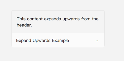
The expandDirection property controls whether the content area expands upwards or downwards from the header.
Expander.Down(default): Content expands below the header.Expander.Up: Content expands above the header.
import RinUI // Consistent import

Expander {
    text: qsTr("Expand Upwards Example")
    expandDirection: Expander.Up
    width: 300

    Text {
        Layout.fillWidth: true
        padding: 10
        text: qsTr("This content expands upwards from the header.")
    }
}
Key Properties
expanded:bool- Controls whether the content area is visible (true) or hidden (false). Defaults tofalse. Can be toggled.text:string- Text displayed in the default header structure. This is ignored if a customheaderitem is provided.header:Item(alias forheaderCustom.data) - Allows providing a custom QMLItemto be used as the header. The children of this item will populate the custom header area.contentData:list<Item>(default property alias forcontentLayout.data) - Child QML items placed here form the content of the collapsible section. They are parented to an internalColumnLayout.expandDirection:enumeration- Can beExpander.Down(default) orExpander.Up. Determines the direction in which the content area expands.headerHeight:real(alias) - References the calculated height of the header section.contentHeight:real(alias) - References the calculated height of the content section when expanded.contentPadding:real(alias) - Padding within the contentFrame. Default is7.contentSpacing:real(alias) - Spacing for the internalColumnLayoutthat holdscontentData.radius:real- Corner radius for the entireExpandercomponent. Defaults toTheme.currentTheme.appearance.windowRadius.enabled:bool- Whether the expander can be interacted with (e.g., clicked to expand/collapse). Defaults totrue.
Animations
The Expander includes built-in animations for the expand/collapse process (height and y-position changes) and for the rotation of the default expand/collapse indicator icon in the header.