ComboBox
A ComboBox allows users to select one option from a dropdown list. It can be configured to be editable, allowing users to input values not present in the list.
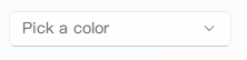
Basic ComboBox
A standard ComboBox with a list of string items.
qml
import QtQuick 2.15
import RinUI
// ...
ComboBox {
width: 200
model: ["Blue", "Green", "Red", "Yellow"]
placeholderText: qsTr("Pick a color")
// currentIndex: 0 // To select "Blue" initially
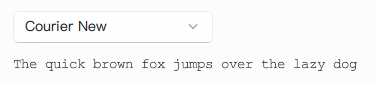
}ComboBox with ListModel
For more complex items or when the model needs to be dynamic, a ListModel can be used. Each ListElement in the model should have a property that can be used for display (e.g., text or value).
qml
import QtQuick.Controls 2.15 // For ListModel, if not implicitly available
import RinUI // Added for consistency
ComboBox {
width: 200
model: ListModel {
ListElement { text: "Arial" }
ListElement { text: "Comic Sans MS" }
ListElement { text: "Courier New" }
}
// RinUI's ComboBox typically infers the display text from the model.
// If your model elements are objects, ensure they have a 'text' or 'value' property,
// or check if specific display roles are supported by RinUI's ComboBox implementation.
placeholderText: qsTr("Select a font")
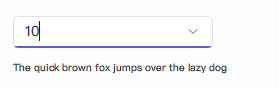
}Editable ComboBox
Set editable to true to allow users to type in values. The accepted() signal can be used to handle new input. The input field is a TextField.
qml
import RinUI // Added for consistency

ComboBox {
    width: 200
    editable: true
    model: ListModel {
        id: sizeModel
        ListElement { value: 8 } // 'value' will be used for display by currentText
        ListElement { value: 10 }
        ListElement { value: 12 }
    }
    placeholderText: qsTr("Enter or select a size")

    onAccepted: {
        // Example: Add new unique numeric value to the model
        if (find(editText) === -1) { // editText contains the text from the input field
            let num = Number(editText)
            if (!isNaN(num)) {
                sizeModel.append({ value: num })
                // Optionally, set currentIndex to the newly added item
                // currentIndex = count - 1
            } else {
                console.log("Invalid input:", editText)
            }
        }
    }
}
Refer to
Rin-UI/examples/pages/controls/ComboBox.qmlfor more detailed examples.
Key Properties
model:any- The model providing data (e.g., list of strings,ListModel).currentIndex:int- Index of the currently selected item.currentText:string- Text of the currently selected item. (Read-only)displayText:string- Text displayed in the ComboBox field, especially wheneditable. (Read-only for non-editable)placeholderText:string- Text shown when no item is selected or wheneditableand empty.editable:bool- Iftrue, the user can type text. Defaults tofalse.maxHeight:real- Maximum height of the dropdown menu (alias formenu.maxHeight).headerText:string- Optional header text within the dropdown.controlRadius:real- Corner radius of the ComboBox.enabled:bool- Whether the control is interactive.popup:Popup(specifically aContextMenuin RinUI) - The dropdown list.indicator:Item- The dropdown arrow indicator item.
Signals
accepted(): Emitted when the user accepts the text in an editable ComboBox (e.g., by pressing Enter).activated(int index): Emitted when the user selects an item. Theindexargument is the index of the activated item. Ifeditableand the text does not match an item,indexwill be -1.