Flyout
A Flyout displays lightweight UI that is either informational or requires user interaction. Unlike a Dialog, a Flyout is typically attached to a specific control and can be light-dismissed by clicking or tapping outside of it (standard Popup behavior). It's often used to show more details, collect simple input, or ask for confirmation.
Flyouts inherit from QtQuick.Controls.Basic.Popup.
Basic Flyout
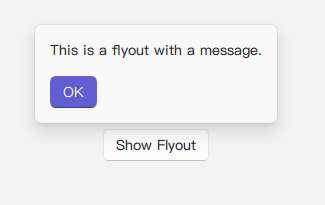
A Flyout is often opened in response to a button click or other user action. It can contain text and custom buttons. The target property can be used to associate the flyout with the control that opens it, which helps in positioning.
import QtQuick 2.15
import RinUI // This should make RinUI's Position enum available

// ...

Button {
    id: myButton
    text: qsTr("Show Flyout")
    onClicked: myFlyout.open()
}

Flyout {
    id: myFlyout
    parent: myButton // Positions the flyout relative to myButton
    text: qsTr("This is a flyout with a message.")

    // Add buttons by assigning a list of QML items to buttonBox
    buttonBox: [
        Button {
            text: qsTr("OK")
            highlighted: true // Example: style the default action
            onClicked: myFlyout.close()
        }
    ]
}
Flyout with Image and Positioning
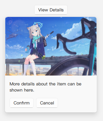
Flyouts can display an image at the top and be positioned relative to their parent or target control using the position property. This property uses a RinUI-specific Position enum.
import RinUI // Consistent import

Button {
    id: detailsButton
    text: qsTr("View Details")
    onClicked: detailsFlyout.open()

    Flyout {
        id: detailsFlyout
        // You can directly nest Flyout inside a button without defining the parent attribute.

        // Position enum likely includes: Position.Top, Position.Bottom, Position.Left, Position.Right
        // Position.Center (if available) might center it on the target or screen.
        position: Position.Bottom // Example: show below the target
        image: Qt.resolvedUrl("../../assets/BA_Pic_Shiroko-chibi.png") // Ensure path is correct
        text: qsTr("More details about the item can be shown here.")
        maximumWidth: 300
        buttonBox: [
            Button {
                text: qsTr("Confirm")
                onClicked: detailsFlyout.close()
            },
            Button {
                text: qsTr("Cancel")
                onClicked: detailsFlyout.close()
            }
        ]
    }
}
Key Properties
text:string- The main text content displayed within the flyout.image:url- An optional image URL to display at the top of the flyout. The image is displayed withfillMode: Image.PreserveAspectCrop.buttonBox:list<Item>- (Alias forbuttonLayout.data) Accepts a list of QML items (typicallyButtons) to be placed in a horizontalRowLayoutat the bottom of the flyout.position:Position(enumeration) - Specifies the preferred position of the flyout (e.g.,Position.Top,Position.Bottom,Position.Left,Position.Right). Defaults toPosition.Top. This uses a customPositionenum from RinUI (likely found inRinUI.utils.Position).maximumWidth:real- The maximum width the flyout content area can expand to. Defaults to350.padding:real- Padding around the content of the flyout. Defaults to16.
Inherited from Popup:
parent:Item- The item to position the flyout relative to. Thexandyproperties of theFlyoutare automatically calculated based ontargetandposition.opened:bool(readonly) - Whether the flyout is currently visible.open(): Method to show the flyout.close(): Method to hide the flyout.closePolicy:Popup.ClosePolicy(enumeration) - Defines how the flyout can be closed by user interaction. Typical flyout behavior (light-dismiss) is oftenPopup.CloseOnEscape | Popup.CloseOnPressOutsideParent.
Styling
The Flyout has a styled background (the source indicates an acrylic color, border, and shadow, though the background rectangle itself was commented out in the provided snippet, the styling might be applied differently) and includes enter/exit animations for opacity and position.