Switch
The Switch control is a toggle that allows users to choose between two mutually exclusive options, typically representing an "on" or "off" state. Selecting an option results in an immediate commit of that state. It inherits from the standard QtQuick.Controls.Switch.
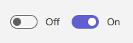
Basic Switch
A Switch displays a visual knob that slides between two states. By default, it can display "On" or "Off" text based on its state if the main text property is not set.
qml
Switch {
    // checked: true // To make it initially "on"
    onCheckedChanged: {
        if (checked) {
            console.log("Switch is ON. Default text might be '" + checkedText + "'");
        } else {
            console.log("Switch is OFF. Default text might be '" + uncheckedText + "'");
        }
    }
}
Switch with Custom Label Text
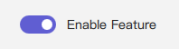
You can provide a persistent custom text label for the Switch using its text property. This label remains the same regardless of the on/off state.
qml
import RinUI // Consistent import

Switch {
    text: qsTr("Enable Feature") // This text will always be shown
    checked: true
}
Switch with Custom On/Off State Text
If the main text property is empty, the Switch can display different text labels depending on its checked state by setting checkedText and uncheckedText.

qml
import RinUI // Consistent import

Switch {
    checked: false
    // text: "" // Ensure main text property is empty to use these
    checkedText: qsTr("Working")    // Text displayed when checked is true
    uncheckedText: qsTr("Do work")  // Text displayed when checked is false
}
Key Properties
checked:bool- Determines if the Switch is in the "on" (true) or "off" (false) state.text:string- An optional, persistent label for the Switch. If set, it overrides the display ofcheckedTextanduncheckedText.checkedText:string- Text displayed next to the switch whencheckedistrueand thetextproperty is empty. Defaults to "On" (or its localized equivalent).uncheckedText:string- Text displayed next to the switch whencheckedisfalseand thetextproperty is empty. Defaults to "Off" (or its localized equivalent).primaryColor:color- The background color of the switch track whencheckedistrue.backgroundColor:color- The background color of the switch track whencheckedisfalseand not hovered.enabled:bool- Whether the control is interactive. Defaults totrue.
Signals
onCheckedChanged(): Emitted when thecheckedstate changes. This is the most common signal to react to state changes.onClicked(): Emitted when the Switch is clicked by the user. This action also toggles thecheckedstate.