CheckBox
The CheckBox control allows users to make a binary choice, such as selecting or deselecting an option. Checkboxes can also be used to represent a tri-state selection, often used in "select all" scenarios.
Basic CheckBox
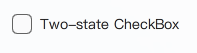
A CheckBox can be used for simple boolean selections.
import QtQuick 2.15
import RinUI // Consistent with Button.md

// ...

CheckBox {
    text: qsTr("Standard CheckBox")
    // checked: true // for initially checked
}
Three-State CheckBox
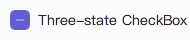
Set the tristate property to true to enable a third "indeterminate" state. This is visually distinct and often used to indicate that an option is set for some, but not all, child items.
The checkState property can be:
Qt.CheckedQt.UncheckedQt.PartiallyChecked(whentristateis true)
CheckBox {
    text: qsTr("Three-state CheckBox")
    tristate: true
    // To set programmatically:
    // checkState: Qt.PartiallyChecked
}
Grouped CheckBoxes
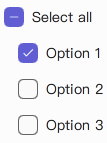
CheckBoxes can be used to control a parent "select all" CheckBox. The example examples/pages/controls/CheckBox.qml demonstrates this using ButtonGroup.
// Simplified concept; refer to examples/pages/controls/CheckBox.qml for full usage with ButtonGroup
Column {
    CheckBox {
        id: parentBox
        text: qsTr("Select all")
        tristate: true
        // In a real scenario, parentBox.checkState would be managed based on child states
    }

    CheckBox {
        text: qsTr("Option 1")
        // Connect checked state to logic updating parentBox
    }

    CheckBox {
        text: qsTr("Option 2")
        // Connect checked state to logic updating parentBox
    }
}
Note: The example in
Rin-UI/examples/pages/controls/CheckBox.qmlprovides a complete implementation for grouped checkboxes usingButtonGroup.
Key Properties
text:string- The label displayed next to the CheckBox.checked:bool- For two-state checkboxes,trueif checked,falseotherwise.checkState:enumeration- The current state (Qt.Unchecked,Qt.Checked,Qt.PartiallyChecked).tristate:bool- Iftrue, the CheckBox supports three states. Defaults tofalse.primaryColor:color- The color of the checkmark and indicator when checked or partially checked.backgroundColor:color- The background color of the indicator box when unchecked.spacing:real- Spacing between the indicator and the text label.enabled:bool- Whether the control is interactive.