Slider
The Slider component allows users to select a value from a continuous or discrete range by dragging a handle along a track. It can be displayed horizontally or vertically and can optionally show tick marks and a tooltip for the current value. RinUI's Slider inherits from QtQuick.Controls.Basic.Slider.
Slider with Range and Steps
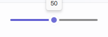
Define the slider's range using from and to, and control the increment with stepSize. The value property sets the slider's current position.
qml
Slider {
    width: 200
    from: 0
    to: 100
    stepSize: 10 // Value will change in increments of 10
    value: 50   // Initial value
}
Slider with Tick Marks
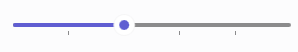
Set tickmarks to true to display visual markers. tickFrequency controls the interval of these ticks. If tickFrequency is 0 or not set, ticks might align with stepSize.
qml
Slider {
    width: 300
    from: 0
    to: 100
    stepSize: 10
    tickmarks: true
    tickFrequency: 20 // A tick mark every 20 units
}
Vertical Slider
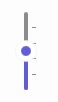
Set orientation to Qt.Vertical for a vertical slider.
qml
Slider {
    height: 150 // For vertical sliders, height is more relevant for primary dimension
    orientation: Qt.Vertical
    from: 0
    to: 100
    value: 75
    tickmarks: true
    tickFrequency: 25
}
Key Properties
value:real- The current value of the slider.from:real- The minimum value. Defaults to0.0.to:real- The maximum value. Defaults to1.0.stepSize:real- The smallest increment by which the value can change. Defaults to0.0(continuous).orientation:enumeration-Qt.Horizontal(default) orQt.Vertical.tickmarks:bool- Iftrue, displays tick marks. Defaults tofalsein RinUI's Slider source.tickFrequency:real- The interval for tick marks. Relevant iftickmarksistrue.snapMode:enumeration- Defines how the handle snaps to values. RinUI'sSliderdefaults toSlider.SnapAlways.showTooltip:bool- Iftrue(default in RinUI), a tooltip with the current value appears on hover/drag.handleSize:real- Base size of the draggable handle.trackHeight:real- Thickness of the slider track.primaryColor:color- Color for the filled portion of the track and handle accents.enabled:bool- Whether the control is interactive.
Signals
valueChanged(real value): Emitted when thevalueproperty changes, regardless of whether it was by user interaction or programmatically.valueModified(real value): Emitted specifically when the user modifies the value through interaction (e.g., dragging the handle).moved(real value): Emitted when the handle has been moved by user interaction, effectively similar tovalueModified.