Dialog
The Dialog component provides a modal window that can be used to display important information or request user input. It overlays the current view, requiring the user to interact with it before returning to the main application content. RinUI's Dialog extends the standard QtQuick.Controls.Dialog with custom styling, animations, and a predefined structure including a title area and a footer for standard buttons.
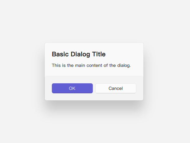
Basic Dialog
A basic dialog consists of a title, content, and standard buttons (e.g., Ok, Cancel). Content items are added as direct children of the Dialog component.
import QtQuick 2.15
import RinUI
// ...
Button {
text: qsTr("Show Basic Dialog")
onClicked: basicDialog.open()
}
Dialog {
id: basicDialog
title: qsTr("Basic Dialog Title")
// modal: true is default via Overlay.modal usage in the component
standardButtons: Dialog.Ok | Dialog.Cancel
// Content items are added as children here
Text {
text: qsTr("This is the main content of the dialog.")
}
onAccepted: {
console.log("Dialog accepted!");
// Perform action on OK
}
onRejected: {
console.log("Dialog rejected or closed.");
// Handle cancellation
}
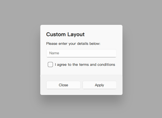
}Custom Content
You can place any QML components as children of the Dialog to create custom layouts and interactions within the dialog's content area. These children are automatically parented to an internal ColumnLayout within the Dialog's contentItem.
import RinUI // Consistent import

Dialog {
    id: customDialog
    title: qsTr("Custom Layout")
    modal: true  // Modal dialog, with overlay

    standardButtons: Dialog.Apply | Dialog.Close // Example using Apply and Close

    // These items become children of the internal ColumnLayout
    Text {
        text: qsTr("Please enter your details below:")
        Layout.fillWidth: true // Assuming ColumnLayout is used internally
    }
    TextField { // Assuming TextField is another RinUI component or a standard one
        id: nameField
        placeholderText: qsTr("Name")
        Layout.fillWidth: true
    }
    CheckBox { // Assuming CheckBox is another RinUI component
        id: agreeCheck
        text: qsTr("I agree to the terms and conditions")
        Layout.fillWidth: true
    }

    // Handling the Apply button
    onApply: {
        if (agreeCheck.checked) {
            console.log("Applied with name:", nameField.text);
            customDialog.close(); // Close the dialog after applying
        } else {
            console.log("Terms not agreed.");
            // Optionally, inform the user they must agree
        }
    }

    // onClose is emitted when Dialog.Close is clicked or close() is called
    onClose: {
        console.log("Custom dialog was closed.");
    }
}
Key Properties
title:string- The text displayed in the title area of the dialog.standardButtons:Dialog.StandardButtons(enumeration) - A combination of standard buttons to display (e.g.,Dialog.Ok,Dialog.Cancel,Dialog.Yes,Dialog.No,Dialog.Apply,Dialog.Close). These are managed by an internalDialogButtonBoxin the footer.modal:bool- (Inherited) Iftrue, the dialog blocks interaction with the rest of the application. RinUI'sDialogusesOverlay.modalwhich effectively makes it modal.contentItem:Item(readonly) - The item that parents the content of the dialog (this is an internalColumnLayoutin RinUI'sDialog). Child items added directly to theDialogare automatically reparented to thiscontentItem.padding,topPadding,bottomPadding:real- Control padding within the dialog. Default is 24 for all.implicitWidth:real- Calculated based on content and predefined min/max values (Utils.dialogMinimumWidth,Utils.dialogMaximumWidth).closePolicy:Popup.ClosePolicy(enumeration) - Defines how the dialog can be closed by user interaction. RinUI'sDialogdefaults toPopup.NoAutoClose, meaning it typically requires explicit button clicks (like Ok, Cancel, or a custom close button) or callingclose(),accept(), orreject().
Methods
open(): Shows the dialog.close(): Hides the dialog. This typically emitsrejected()unlessaccept()orreject()was called.accept(): Closes the dialog and emits theaccepted()signal.reject(): Closes the dialog and emits therejected()signal.
Signals
accepted(): Emitted when the dialog is accepted (e.g., by clicking an OK or Yes button, or callingaccept()).rejected(): Emitted when the dialog is rejected or dismissed (e.g., by clicking a Cancel or No button, or callingreject()orclose()).- Specific signals corresponding to
standardButtons(e.g.,applied(),helpRequested()) are also available from the baseQtQuick.Controls.Dialog.
Styling and Behavior
- Background & Overlay: The dialog has a styled background (acrylic color, border, radius) and a smoke effect overlay for modality.
- Animations: Includes
enterandexittransitions for opacity and scale. - Footer: The
footeris automatically populated by aDialogButtonBoxbased on thestandardButtonsproperty. For fully custom button arrangements, you might need to avoidstandardButtonsand add custom buttons directly as content, then manage theironClickedhandlers to callaccept(),reject(), orclose(). - Header: The
headerproperty is an emptyItemby default but can be replaced with custom QML for a more complex header area if needed (thoughtitleis usually sufficient).