ToggleButton
The ToggleButton is a button that can be toggled between two states: checked (on) and unchecked (off). It functions like a checkbox but has the appearance of a standard button. Its visual state (e.g., background color) typically changes to indicate whether it's checked or unchecked, as its highlighted property is automatically bound to its checked state.
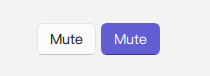
Basic ToggleButton
A ToggleButton displays text and/or an icon and maintains a checked state. It is checkable by default.
qml
import QtQuick 2.15
import RinUI
// ...
ToggleButton {
text: qsTr("Mute")
checked: false // Initial state
onCheckedChanged: {
if (checked) {
console.log("Mute is ON");
// Apply mute action
} else {
console.log("Mute is OFF");
// Remove mute action
}
}
}Key Properties
text:string- The text label displayed on the button.icon.name:string- The name of the fluent icon for the button.icon.source:url- The URL for a custom image icon for the button.checked:bool- Determines if the button is in the checked (on) or unchecked (off) state.checkable:bool- Indicates if the button can be checked. Defaults totrueforToggleButton.highlighted:bool- Automatically reflects thecheckedstate. This property is typically used by the button's styling to change its appearance when it is checked/highlighted.enabled:bool- Whether the control is interactive. Defaults totrue.
As ToggleButton inherits from Button, other styling and behavior properties from Button (like flat, primaryColor) can also be applied.
Signals
onCheckedChanged(): Emitted when thecheckedstate changes. This is the primary signal to react to the toggle action.onClicked(): Emitted when the button is clicked. Since it'scheckableby default, a click will also toggle thecheckedstate.