PillButton
The PillButton is a type of toggle button that is styled to have a pill-like or capsule shape, inheriting from RoundButton. It's designed to be checked and unchecked, visually indicating its state by becoming highlighted when checked.
Basic PillButton
A PillButton can be used to represent an on/off state or a selection. It is checkable by default.
qml
import QtQuick 2.15
import RinUI

// ...

PillButton {
    text: qsTr("Toggle Option")
    // checked: true // To make it initially checked/on
    onCheckedChanged: {
        if (checked) {
            console.log("PillButton is ON");
        } else {
            console.log("PillButton is OFF");
        }
    }
}
PillButton with Icon
Icons can be added to a PillButton, similar to a standard Button.
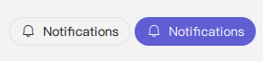
qml
import RinUI // Added for consistency, QtQuick import not strictly needed for this snippet if already globally available

PillButton {
    text: qsTr("Notifications")
    icon.name: "ic_fluent_alert_20_regular"
    checked: true // Example: initially on

    // Example of changing icon based on state:
    // icon.name: checked ? "ic_fluent_alert_on_20_filled" : "ic_fluent_alert_20_regular"
}
Key Properties
text:string- The text label displayed on the button.icon.name:string- The name of the fluent icon for the button.icon.source:url- The URL for a custom image icon for the button.checked:bool- Determines if the button is in the checked (on) or unchecked (off) state. Thehighlightedproperty is automatically bound tochecked.checkable:bool- Indicates if the button can be checked. Defaults totrueforPillButton.enabled:bool- Whether the control is interactive. Defaults totrue.
As PillButton inherits from RoundButton (which in turn likely inherits from Button), other styling properties from its parent components can also be applied.
Signals
onCheckedChanged(): Emitted when thecheckedstate changes.onClicked(): Emitted when the button is clicked. Since it'scheckable, a click will also toggle thecheckedstate.