DropDownButton
A DropDownButton is a type of button that, when clicked, displays a menu of options. It combines the appearance of a button with a dropdown menu functionality.
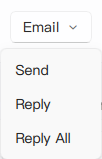
Basic DropDownButton
A DropDownButton typically has a text label and a dropdown indicator. Menu items are defined as children, which populate its internal menu.
qml
import QtQuick 2.15
import RinUI

// ...

DropDownButton {
    text: qsTr("File")

    MenuItem {
        text: qsTr("New")
        onTriggered: console.log("New clicked")
    }
    MenuItem {
        text: qsTr("Open")
        onTriggered: console.log("Open clicked")
    }
    // Assuming MenuSeparator is available and compatible:
    // MenuSeparator { }
    MenuItem {
        text: qsTr("Save")
        onTriggered: console.log("Save clicked")
    }
}
DropDownButton with Icons
Both the button itself and its menu items can include icons.
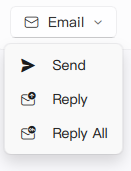
qml
DropDownButton {
    text: qsTr("Email")
    icon.name: "ic_fluent_mail_20_regular" // Sets the icon on the button part

    MenuItem {
        text: qsTr("Send")
        icon.name: "ic_fluent_send_20_filled" // Icon for the menu item
        onTriggered: console.log("Send email")
    }
    MenuItem {
        text: qsTr("Reply")
        icon.name: "ic_fluent_mail_arrow_up_20_regular"
        onTriggered: console.log("Reply email")
    }
}
Key Properties
text:string- The text label displayed on the button part.icon.name:string- The name of the fluent icon for the button part.icon.source:url- The URL for a custom image icon for the button part.contentData:list<Item>- (Default property) Used to populate the dropdown menu with items, typicallyMenuItemandMenuSeparatorcomponents.enabled:bool- Whether the control is interactive. Defaults totrue.
The DropDownButton inherits many properties from the base Button component (like flat, highlighted, primaryColor) for styling the main button appearance. The dropdown itself is managed by an internal Menu component.
Related Components
MenuItem: Used to define individual selectable items within theDropDownButton's menu. Key properties includetext,icon.name,icon.source, and theonTriggeredsignal.MenuSeparator: (If available) Used to create visual separation between groups ofMenuItems.