Clip (Interactive Surface)
The Clip component, found under the "ListAndCollections" category, is a specialized Button that functions as a clickable surface with a customizable frame-like appearance. It utilizes an internal Frame component for its background, exposing properties to control this frame's color, corner radius, and border.
Despite its name, Clip doesn't primarily perform graphical clipping of child content in the traditional QML sense (i.e., via an Item's clip: true property). Instead, it provides a styled, interactive surface.
Basic Usage
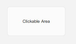
A Clip can be used as a basic clickable area with a defined appearance. Since its contentItem (inherited from Button) is an empty Item by default in this component's source, it's not designed to show text or icons directly using standard Button properties like text or icon.name. If you need to display content, you would typically place QML items as children of the Clip, and they will appear visually on top of its styled background.
import QtQuick 2.15
import RinUI

// ...

Clip {
    id: myClickableSurface
    width: 200
    height: 100

    // Use 'backgroundColor' or the alias 'color' to set the surface color
    backgroundColor: Theme.currentTheme.colors.controlColor
    radius: 8
    borderColor: Theme.currentTheme.colors.controlBorderColor
    borderWidth: 1

    onClicked: {
        console.log("Clip surface clicked!");
    }

    // Example of adding content visually on top
    Text {
        anchors.centerIn: parent
        text: qsTr("Clickable Area")
    }
}
Key Properties
color:color(alias for the internalFrame's background color, which is also tied toButton'sbackgroundColor) - Sets the background color of the surface. Can be used interchangeably withbackgroundColor.radius:real(alias for internalFrame'sradius) - Sets the corner radius of the surface.borderColor:color(alias for internalFrame'sborderColor) - Sets the border color of the surface.borderWidth:real(alias for internalFrame'sborderWidth) - Sets the border width of the surface.
Inherited from Button:
backgroundColor:color- This property directly controls the background color of the internalFrame. Thecolorproperty ofClipis an alias to this.- Standard
Buttonproperties likeenabled,flat,highlighted,checkable, visual state properties, etc., are available and will affect theClip's appearance and behavior.
Signals
onClicked(): Emitted when theCliparea is clicked.- Other signals from
Button(e.g.,pressedChanged,released) are also available.
Notes
- Content Display: The
contentItemof thisClipcomponent is an emptyItem. To display text or icons within theClip's interactive area as part of its defined content (like a typical button), you would need to customize or replace thecontentItem. For simply placing visuals on top, making them children of theClipitself (as in the example) works. - Naming: The name "Clip" might be slightly misleading if expecting an item that primarily performs graphical clipping of its children. It functions more as an interactive, styled surface or a "FrameButton".
- Background Frame: The actual component providing the visual background is a
Frame. Understanding theFramecomponent (if documented separately) might offer more context on its specific styling capabilities.