TimePicker
The TimePicker allows users to select a time (hours and minutes, with an optional AM/PM designator). It appears as a button displaying the currently selected time (or placeholders). When clicked, it opens a custom picker view (an internal PickerView component) to allow the user to change the time.
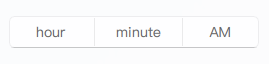
Basic TimePicker (12-hour format)
By default, TimePicker uses a 12-hour clock format with an AM/PM selector. The displayed values for hour, minute, and AM/PM are based on the component's current selection.
import QtQuick 2.15
import RinUI
// ...
TimePicker {
id: myTimePicker
width: 250 // Default implicitWidth
// React to time changes
// The 'time' property provides the time in "HH:MM" (24-hour) format
onTimeChanged: {
console.log("Selected time (24-hr format):", time);
// Individual parts can also be accessed:
console.log("Hour:", hour, "Minute:", minute, "Period:", hourSystem); // hourSystem is AM/PM
}
Component.onCompleted: {
// setTime expects "HH:MM" in 24-hour format
myTimePicker.setTime("14:30"); // Sets to 2:30 PM
}
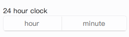
}24-Hour Format TimePicker
Set the use24Hour property to true to use a 24-hour clock format. This hides the AM/PM selector.
import RinUI // Consistent import

TimePicker {
    width: 180 // May require less width without AM/PM
    use24Hour: true

    Component.onCompleted: {
        setTime("08:15"); // Sets to 8:15 AM
    }
}
Setting the Time Programmatically
The setTime() method allows you to set the time of the picker. It accepts a string in "HH:MM" (24-hour) format.
import RinUI // Consistent import

TimePicker {
    id: reminderTimePicker
    width: 250

    function initializeTime() {
        // setTime doesn't explicitly return a success boolean in the current source,
        // but it will update the properties if the format is valid.
        reminderTimePicker.setTime("17:00"); // 5:00 PM
        console.log("Reminder time set to:", reminderTimePicker.time);
    }
    Component.onCompleted: initializeTime()
}
Key Properties
time:string(readonly) - A string representation of the selected time in "HH:MM" (24-hour) format. Changes to this property can be tracked withonTimeChanged.hour:string(alias forpickerView.value1) - The selected hour as a string (e.g., "1" to "12" for 12-hour format, or "0" to "23" for 24-hour format based on internal picker model).minute:string(alias forpickerView.value2) - The selected minute as a string (e.g., "0" to "59").hourSystem:string(alias forpickerView.value3) - For 12-hour format, this holds the AM/PM designator (e.g., "AM" or "PM" as defined byamText/pmText). It isundefinedifuse24Houristrue.use24Hour:bool- Iftrue, uses a 24-hour clock format. Defaults tofalse.amText:string- Text used for the AM designator in 12-hour mode. Defaults to a localized "AM".pmText:string- Text used for the PM designator in 12-hour mode. Defaults to a localized "PM".hourText:string- Placeholder text for the hour part if no time is selected/interacted with. Defaults to a localized "hour".minuteText:string- Placeholder text for the minute part if no time is selected/interacted with. Defaults to a localized "minute".enabled:bool- Whether the control is interactive. Inherited fromControl.
Methods
setTime(string hhmm): Sets the picker's current time. The input string must be in "HH:MM" (24-hour) format (e.g., "08:15" or "14:30"). Input like "8:15" might not work; ensure leading zeros for single-digit hours if needed by the component's parsing.
The TimePicker itself is a Button, so properties related to button styling and behavior can also be applied to affect its appearance.