セッティングカード (SettingCard)
SettingCard コンポーネントは Frame を継承し、1つの設定項目または情報をカード形式で表示するために設計されています。左側にオプションのアイコン、中央にタイトルと説明、右側には追加のコントロールや情報を表示する content スロットがあります。
SettingExpander と異なり、SettingCard には展開可能なエリアはなく、シンプルで展開しないパネルとして、明確な設定表示に最適です。
基本的な使い方
SettingCard は通常、icon(アイコン)、title(タイトル)、description(説明)を含みます。右側には content(デフォルトプロパティ)を使ってコントロールを配置できます。
qml
import QtQuick 2.15
import RinUI
// ...
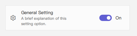
SettingCard {
width: 400 // Or Layout.fillWidth: true if in a Layout like ColumnLayout
icon: "ic_fluent_settings_20_regular" // Fluent icon name for the left area
title: qsTr("General Setting")
description: qsTr("A brief explanation of this setting option.")
// Control placed on the right side via the 'content' default property
Switch { // This Switch is assigned to the 'content' property
checked: true
}
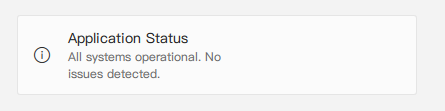
}情報表示としての使用
右側にコントロールが不要な場合(つまり content を指定しない場合)、統一されたスタイルで情報を表示するカードとして使用できます。
qml
import RinUI // Consistent import

SettingCard {
    width: 400
    icon: "ic_fluent_info_20_regular"
    title: qsTr("Application Status")
    description: qsTr("All systems operational. No issues detected.")
    // No child items provided for the 'content' slot on the right
}
主なプロパティ
title:string- カードのタイトル、主に表示されるテキスト。description:string- タイトル下に表示される補足説明。小さなフォントや淡い色で表示。icon:string- 左側のアイコン(Fluent アイコン名、内部はIconWidget.icon)。source:url- カスタム画像をアイコンとして使用する場合の URL。iconSize:real- アイコンのサイズ。デフォルトは20。content:Item- デフォルトプロパティであり、カード右側に表示される QML アイテムを追加できます(例: Switch, ComboBox)。
Frame から継承されたプロパティ:
color:color- 背景色。radius:real- 角の丸み。borderColor:color- 枠線の色。borderWidth:int- 枠線の太さ。frameless:bool- 枠線・背景を非表示にする。hoverable:bool- ホバー効果を有効にする。- パディング:デフォルトで
leftPadding: 15,rightPadding: 15,topPadding: 13,bottomPadding: 13。
リストでの使用例
SettingCard は、それぞれ独立した設定項目の表示に適しており、展開が不要な場面にぴったりです。
qml
import QtQuick.Layouts 1.15 // For ColumnLayout
import RinUI // Consistent import

// ...

ColumnLayout { // Using ColumnLayout for automatic sizing and spacing
    width: 350
    spacing: 2 // Small spacing between cards

    SettingCard {
        Layout.fillWidth: true // Makes the card take the width of the ColumnLayout
        title: qsTr("Profile Visibility")
        icon: "ic_fluent_person_20_regular"
        content: ComboBox { model: ["Public", "Friends Only", "Private"] }
    }
    SettingCard {
        Layout.fillWidth: true
        title: qsTr("Desktop Notifications")
        icon: "ic_fluent_alert_20_regular"
        description: qsTr("Enable or disable desktop notifications.")
        content: Switch { checked: false }
    }
    SettingCard {
        Layout.fillWidth: true
        title: qsTr("Data Sync")
        icon: "ic_fluent_cloud_sync_20_regular"
        description: qsTr("Last synced: 2 hours ago")
        // No control in 'content', just info
    }
}
関連コンポーネント
Frame:ベースコンポーネント、背景と枠線を提供。SettingExpander:詳細な内容を展開表示できる設定用コンポーネント。SettingItem:よりシンプルな行形式の設定表示に使用。SettingExpanderの中でよく使われます。