设置卡片 (SettingCard)
SettingCard 组件继承自 Frame,用于以卡片样式展示单项设置信息或内容。它具有结构化的布局:左侧可选图标、标题与描述区域、中间内容区域,以及右侧的 content 插槽,用于放置额外的控件或信息。
与 SettingExpander 不同,SettingCard 是一个不可展开的单层面板,适用于展示简单直接的设置信息。
基本用法
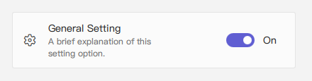
一个典型的 SettingCard 包含 icon 图标、title 标题 和 description 描述。通过 content 属性(默认属性)可在右侧添加控件。
qml
import QtQuick 2.15
import RinUI

// ...

SettingCard {
    width: 400 // Or Layout.fillWidth: true if in a Layout like ColumnLayout
    icon: "ic_fluent_settings_20_regular" // Fluent icon name for the left area
    title: qsTr("General Setting")
    description: qsTr("A brief explanation of this setting option.")

    // Control placed on the right side via the 'content' default property
    Switch { // This Switch is assigned to the 'content' property
        checked: true
    }
}
信息展示用法
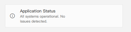
如果不需要右侧的控件(即 content 属性未使用),SettingCard 也可作为信息卡片展示内容,风格一致。
qml
import RinUI // Consistent import

SettingCard {
    width: 400
    icon: "ic_fluent_info_20_regular"
    title: qsTr("Application Status")
    description: qsTr("All systems operational. No issues detected.")
    // No child items provided for the 'content' slot on the right
}
关键属性
title:string- 设置卡片的主标题,展示为主要文本。description:string- 可选描述文字,显示在标题下方,字体较小或颜色较淡。icon:string- 左侧图标,使用 Fluent 图标名(内部是IconWidget的icon属性)。source:url- 用于自定义图像作为图标(对应内部IconWidget的source属性)。iconSize:real- 图标尺寸,默认为20。content:Item- 默认属性,插入右侧的控件(如 Switch、ComboBox 或文本标签)。
继承自 Frame 的属性:
color:color- 卡片背景色。radius:real- 圆角半径。borderColor:color- 边框颜色。borderWidth:int- 边框宽度。frameless:bool- 是否隐藏背景与边框。hoverable:bool- 是否启用悬停效果。- 内边距属性:默认
leftPadding: 15,rightPadding: 15,topPadding: 13,bottomPadding: 13。
在设置列表中的应用示例
SettingCard 适合用于设置项列表,每一项都有独立展示区域,不需要展开部分。
qml
import QtQuick.Layouts 1.15 // For ColumnLayout
import RinUI // Consistent import

// ...

ColumnLayout { // Using ColumnLayout for automatic sizing and spacing
    width: 350
    spacing: 2 // Small spacing between cards

    SettingCard {
        Layout.fillWidth: true // Makes the card take the width of the ColumnLayout
        title: qsTr("Profile Visibility")
        icon: "ic_fluent_person_20_regular"
        content: ComboBox { model: ["Public", "Friends Only", "Private"] }
    }
    SettingCard {
        Layout.fillWidth: true
        title: qsTr("Desktop Notifications")
        icon: "ic_fluent_alert_20_regular"
        description: qsTr("Enable or disable desktop notifications.")
        content: Switch { checked: false }
    }
    SettingCard {
        Layout.fillWidth: true
        title: qsTr("Data Sync")
        icon: "ic_fluent_cloud_sync_20_regular"
        description: qsTr("Last synced: 2 hours ago")
        // No control in 'content', just info
    }
}
相关组件
Frame:基础组件,提供边框和背景。SettingExpander:适用于需要展开详细内容的设置项。SettingItem:用于设置行展示,常与SettingExpander一起使用,结构比SettingCard更简单。