
AutoSuggestBox
AutoSuggestBox 是文本输入控件,当用户开始输入时提供建议,帮助用户快速找到并选择正确的选项。这个控件基于 TextField,但添加了动态建议功能。
基本使用
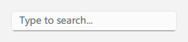
qml
AutoSuggestBox {
    id: control
    width: 240
    placeholderText: qsTr("Type to search...")

    suggestions: [
        "Apple",
        "Banana",
        "Cherry",
        "Date",
        "Elderberry",
        "Fig",
        "Grape",
        "Honeydew"
    ]
}
## 使用自定义模型

<div align="center">
  <img src="/assets/images/docs/AutoSuggestBox/example-3.png" alt="使用自定义模型">
</div>

```qml
AutoSuggestBox {
    id: control
    width: 240
    placeholderText: qsTr("Select a country...")

    textRole: "name"
    suggestions: ListModel {
        ListElement { name: "United States"; code: "US" }
        ListElement { name: "United Kingdom"; code: "GB" }
        ListElement { name: "Japan"; code: "JP" }
        ListElement { name: "Germany"; code: "DE" }
    }
}
## 处理选择

<div align="center">
  <img src="/assets/images/docs/AutoSuggestBox/example.png" alt="处理选择">
</div>

```qml
AutoSuggestBox {
    id: control
    width: 240
    placeholderText: qsTr("Select a color...")

    suggestions: [
        "Red",
        "Green",
        "Blue",
        "Yellow",
        "Purple"
    ]

    onSuggestionChosen: function(suggestion) {
        console.log("Selected:", suggestion)
    }
}
## 重要属性

- `model`: 建议列表的模型,可以是数组或 ListModel
- `textRole`: 当使用 ListModel 时,指定要显示的角色的名称
- `maximumMenuHeight`: 建议下拉菜单的最大高度
- `suggestionChosen(suggestion)`: 当用户选择一个建议时发出的信号

## 重要方法

- `getFilteredSuggestions()`: 返回与当前输入文本匹配的建议列表